BuzzFeed Product Design Intern
Project overview
Project background
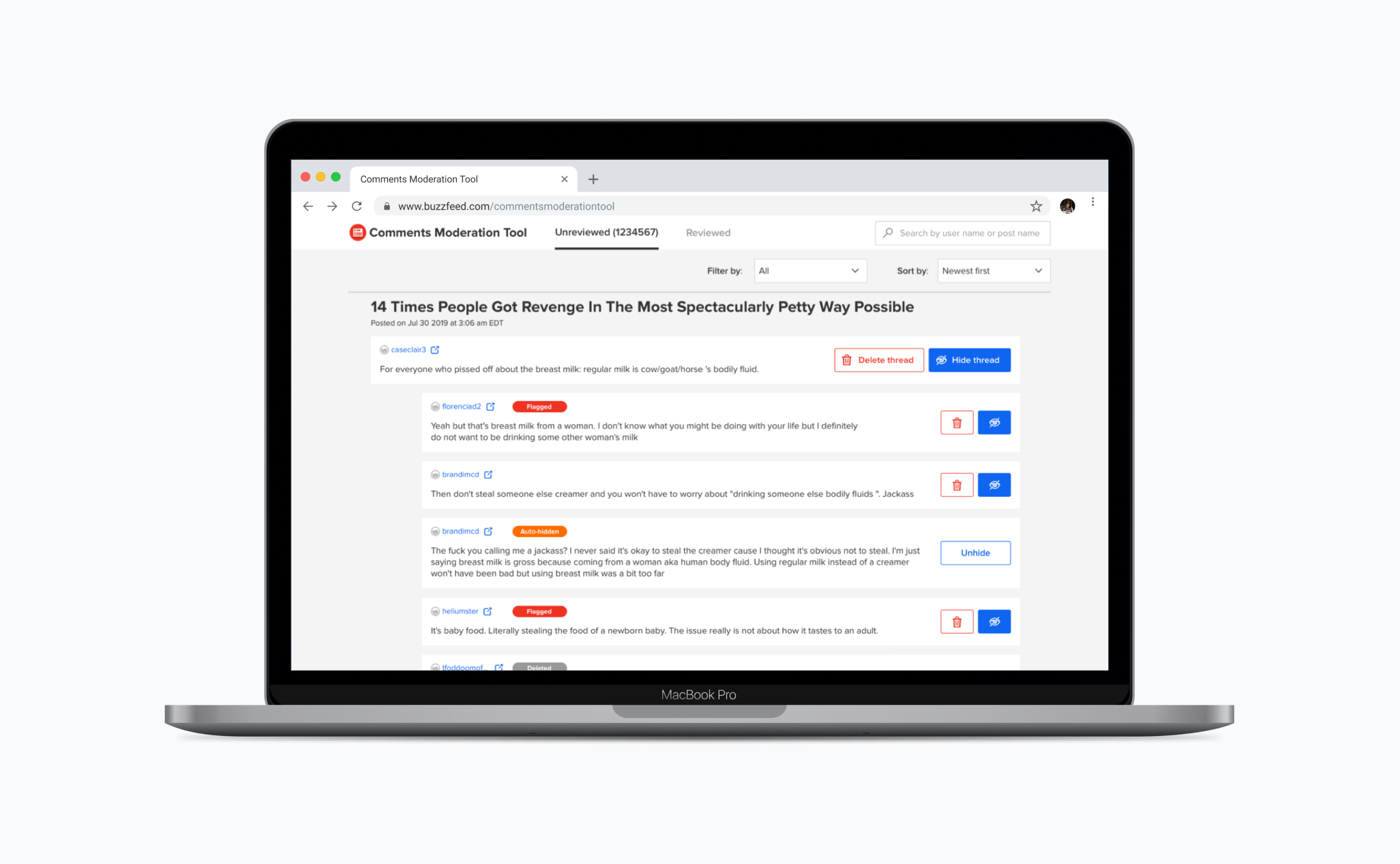
On BuzzFeed Community team, moderating toxic comments/spam is one of the moderators' work. There were significant user experience and efficiency issues on this tool, which made the inbox queue never hit zero. By redesigning the comments moderation tool, I improved moderators' work experience and performance. At the same time, our data scientist team introduced an NLP algorithm to help the moderation work. So the new interface I designed should be able to communicate the new workflow after the NLP algorithm auto-hides/auto-flags some comments. By covering these two aspects, my design improved moderators' work efficiency significantly on moderating comments.
My process
Timeline
July - Aug, 2019
Team
Xu Zeng (Product Design, UX Research)
Dilip Rajan (PM)
Abram Handler (DS)
David Dunlop (SDE)
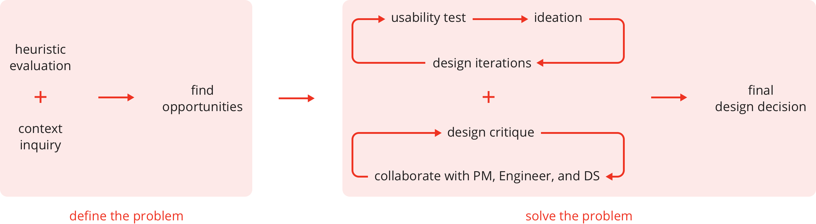
Define the problem
User problems
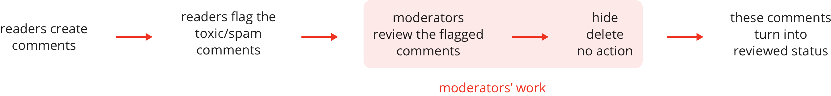
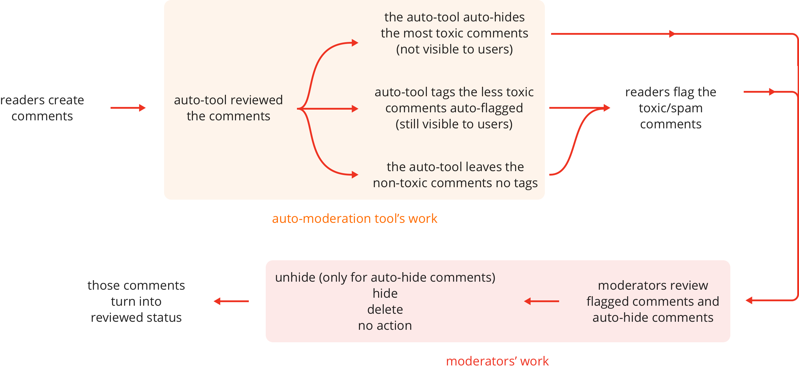
Understand the auto-moderation flow
The flow before introducing the auto-flag/hide algorithm:
The flow after introducing the auto-flag/hide algorithm:
Opportunities
I worked together with the PM to define the scope and primary focus of this project.
1. Overall user experience improvements
- Clearer navigational hierarchy.
- No more batching - moderate and dismiss comments individually.
- Indicate the size of the queue so that moderators can see progress.
2. Make frequent actions easier
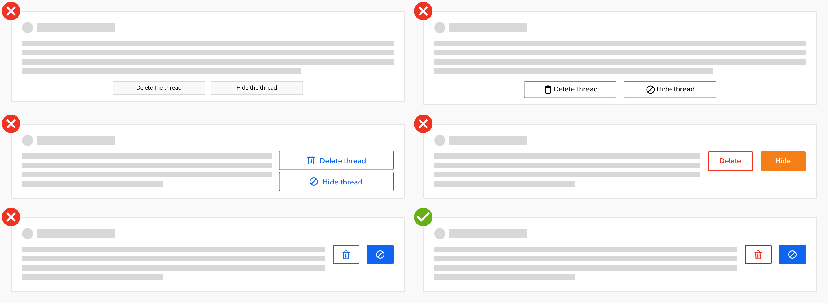
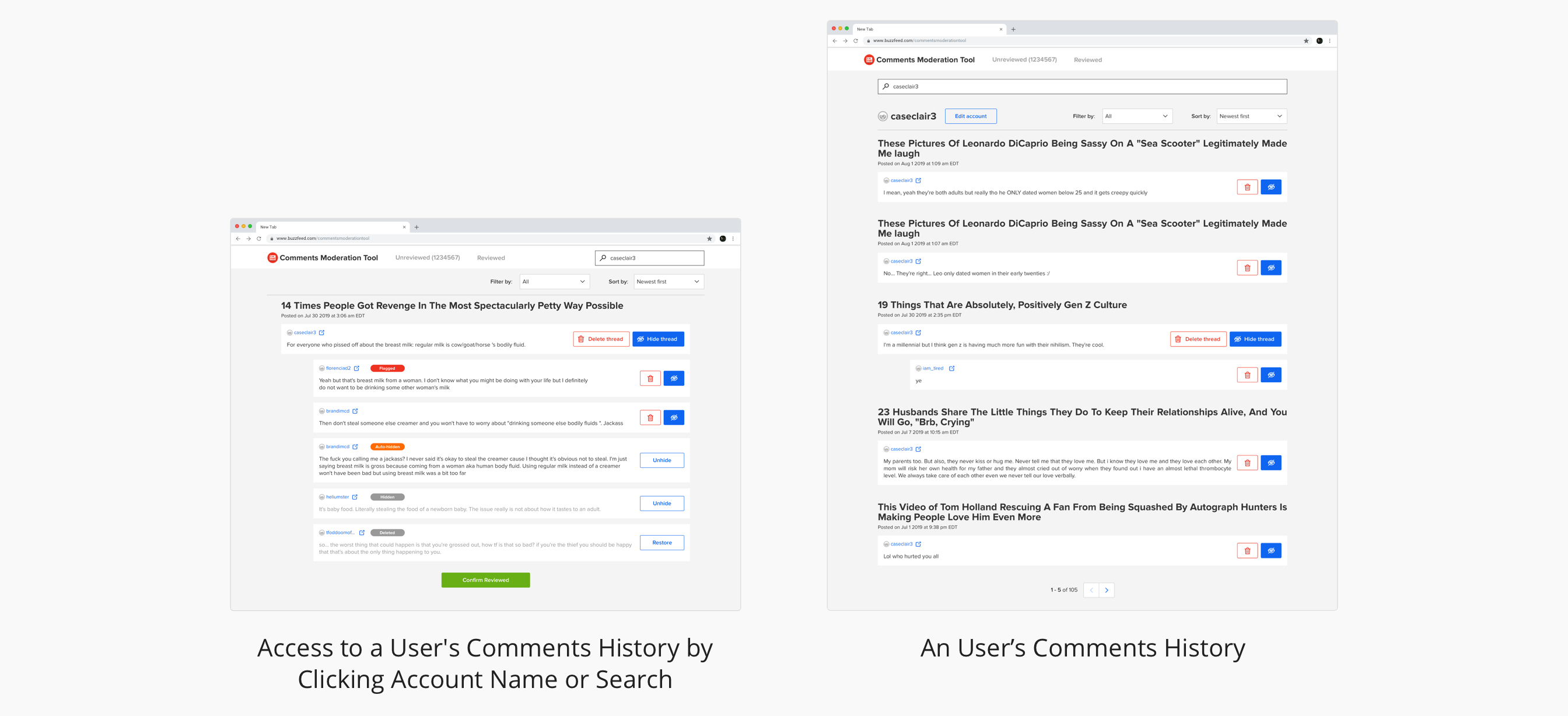
- Shortcut link to view a user’s past comment
- Search for all comments that belong to a particular post (search was only by the user).
3. Integrate comment classification service
- Auto-hide comments with a high level of detected toxicity/spam
- Auto-flag comments with a medium level of detected toxicity/spam
- Visual cues to help moderators understand why a comment was moderated
Solve the problem
Simplify the high level structure
Without formal training, non-tech background moderators have difficulties understanding the tool's mechanism. Showing too much detail information of the backend mechanism would confuse the moderators, but showing too little information is not applicable, neither.
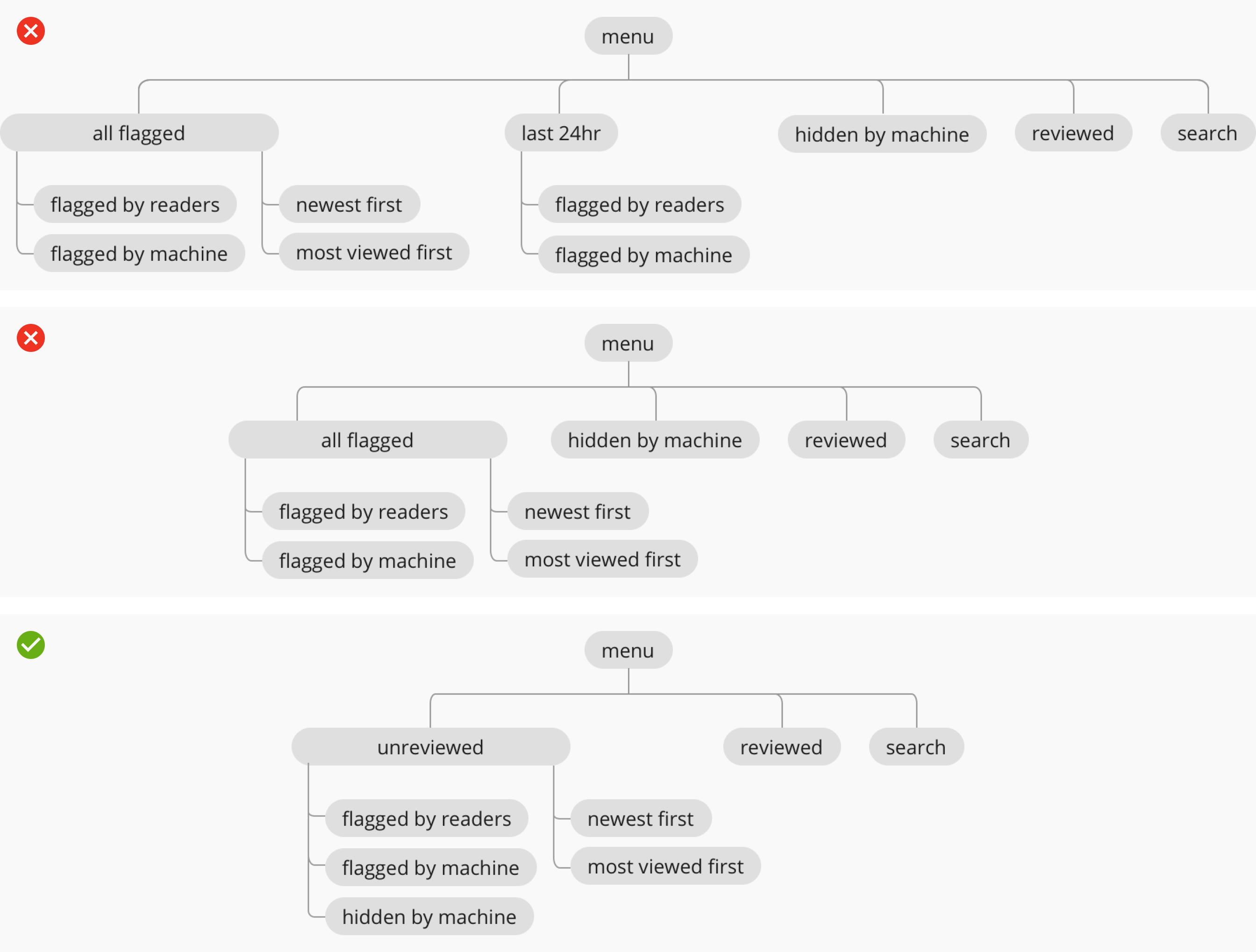
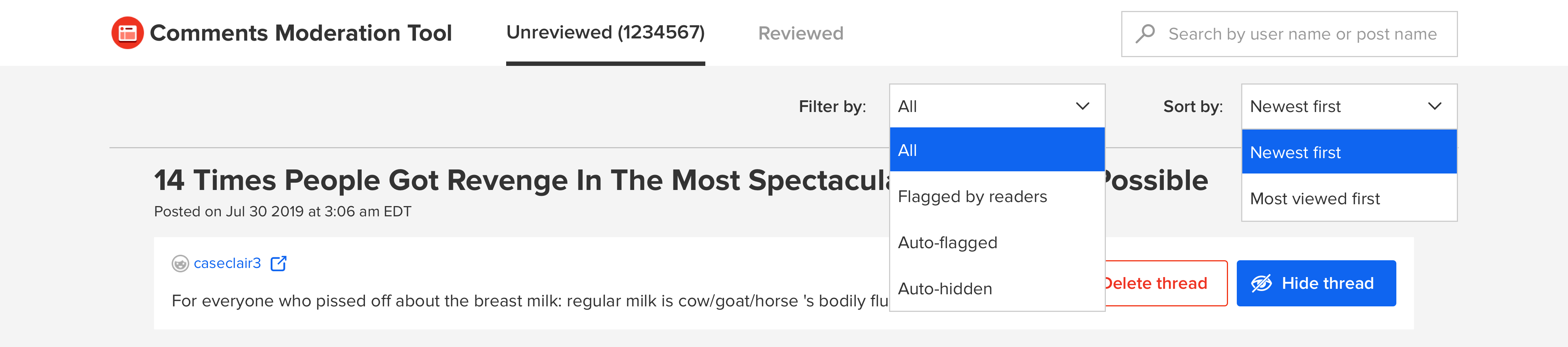
Test and make the design decision:
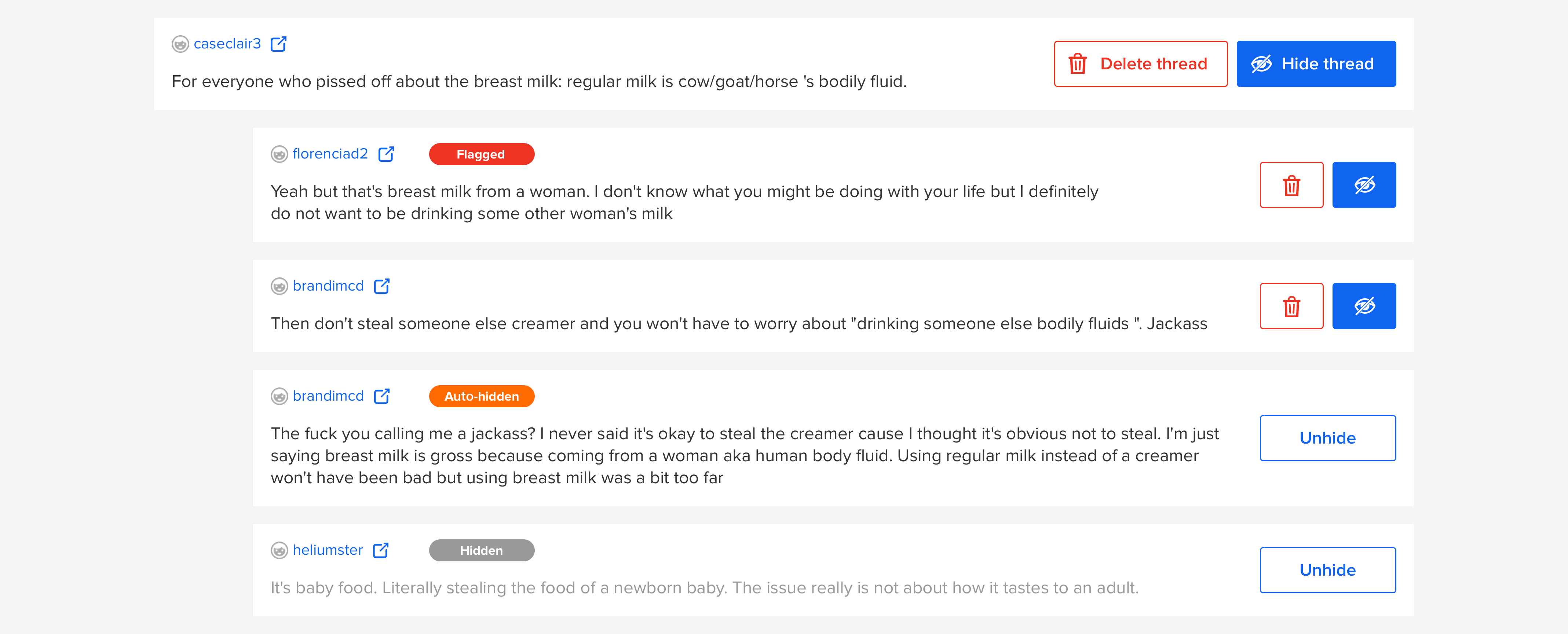
Usability tests show that the moderators follow the same working flow of moderating (1) flagged (auto-flag+reader’s flag) and (2) auto-hidden comments. Moderators care about the comments' content instead of how /why they are added to the queue.
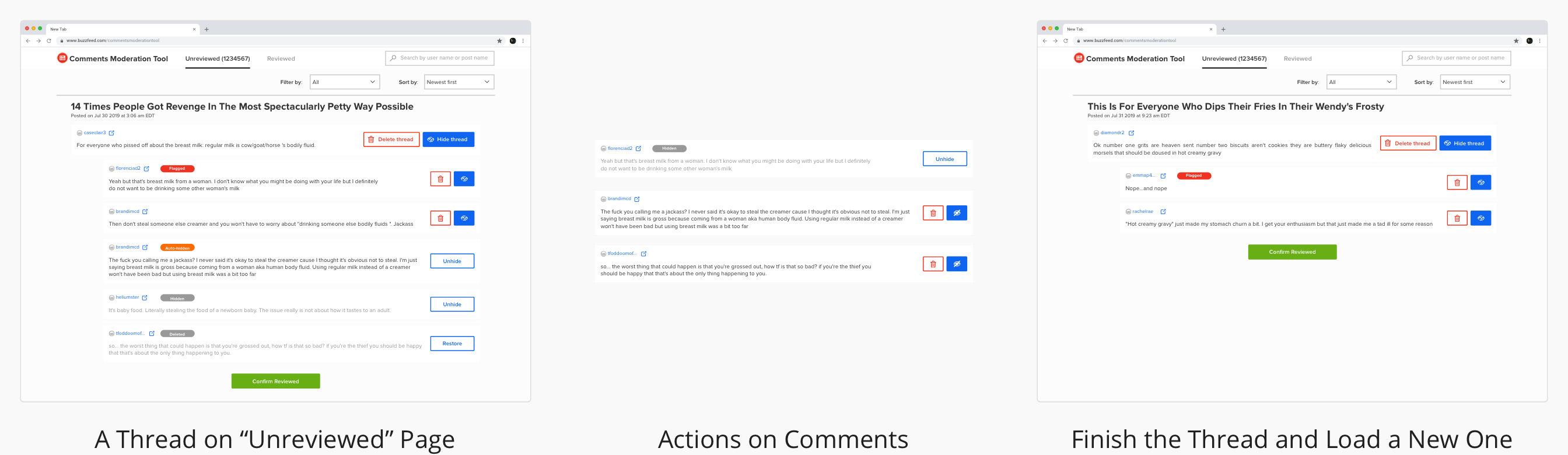
Only "unreviewed" and "reviewed" are the best categorize way to show moderators their to-do work and finished work. Usability tests show that other categorize methods can not indicate that clearly.
Moving forword:
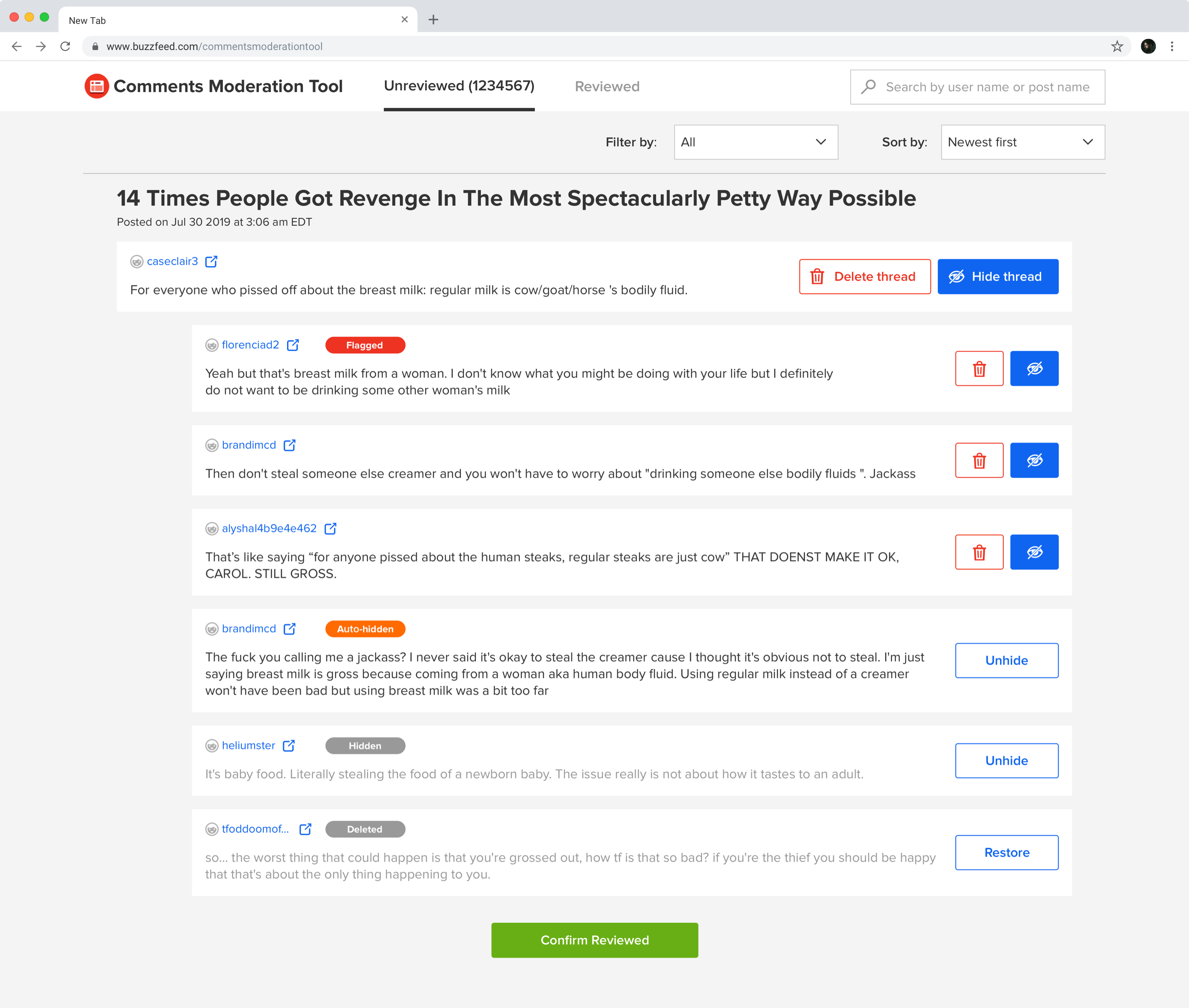
Redesign the comment format to make it easy to scan and take actions on
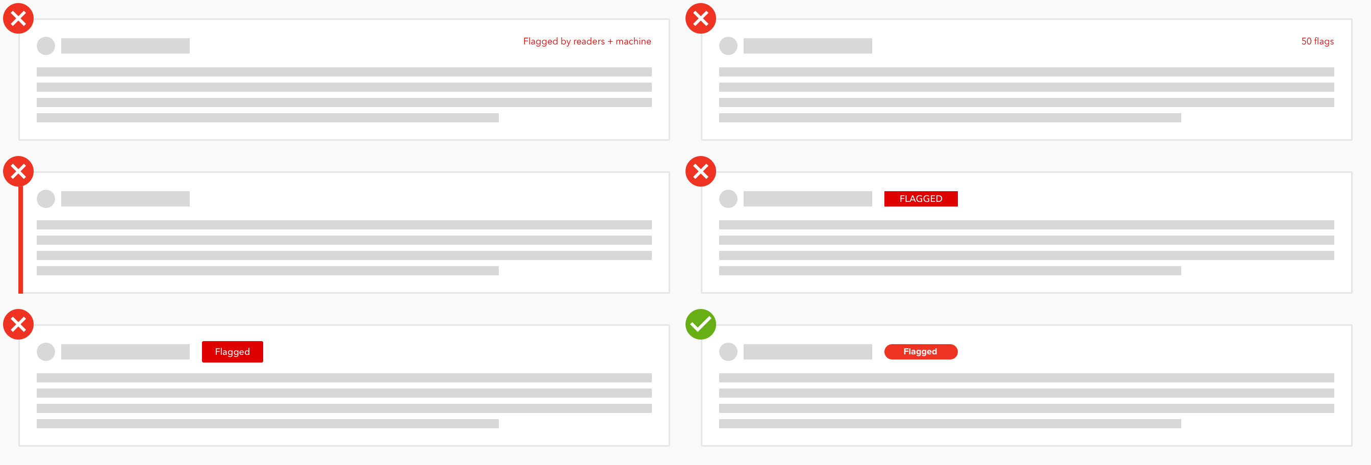
The new design pattern of the tag was introduced to BuzzFeed's design library after this project.
Moving forwrd:
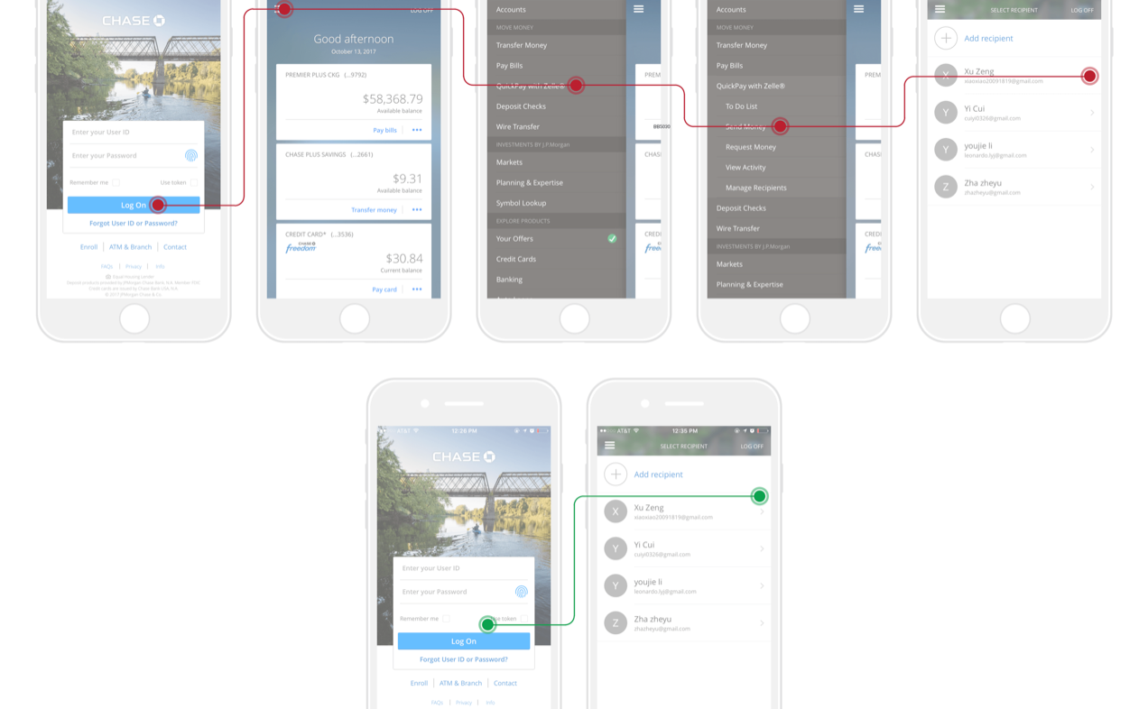
User Flow
Moderate a thread
Track an account's comments history
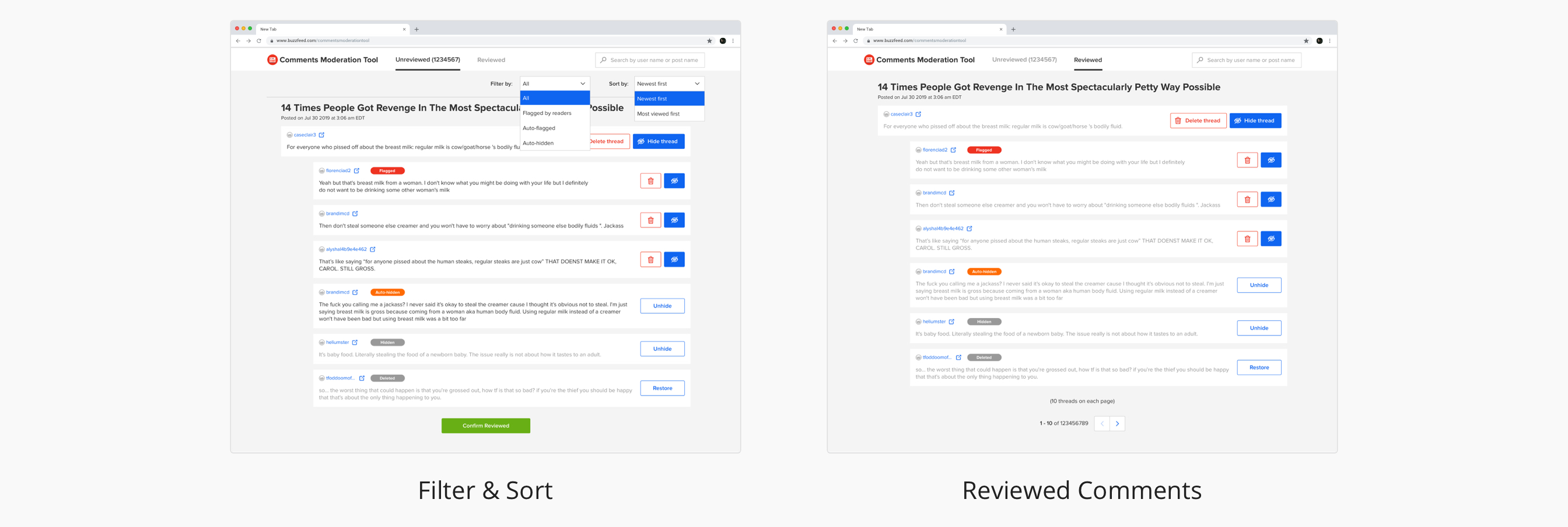
Filter, sort and reviewed categoory
Impact
Quotes from the actual users:
“I do like the count of the queue.” — Kristen (Community Editor)
“I love the way it looks -- I like how clear everything is. Like flagged, auto-hidden, etc.” —Anna (Community Strategist)
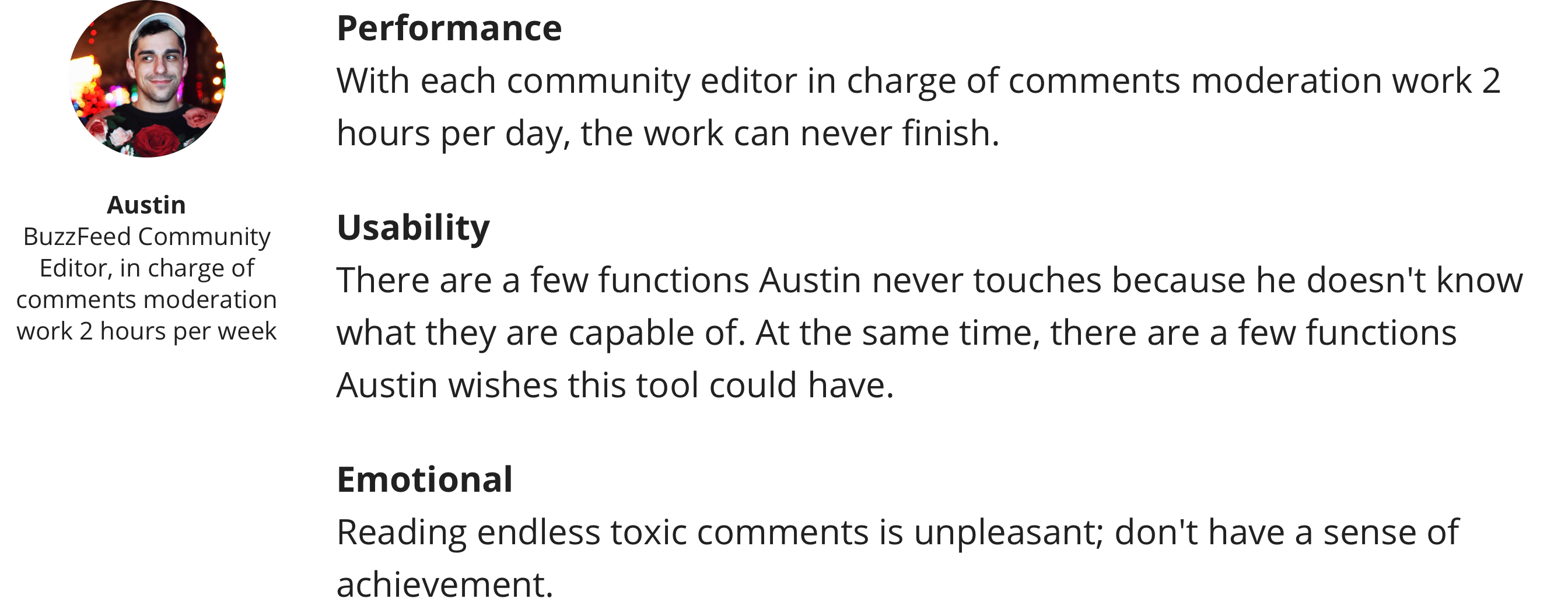
“I like one thread per page. The older one (10 threads per page) sometimes gets overwhelming.” — Austin (Community Editor)
Reflections
What did I learn?
Design
- visual design, interaction design, product thinking, typography, alignment, negative space, choose the color, visual hierarchy
- usability test, heuristic evaluation, context inquiry
- keep my design consistent with BuzzFeed’s Solid Design System and make a contribution to it
- share early, seek for feedback and learn from the feedback
- explore and iteration as much as I can
Communication
- meet the actual users and visit them in their work settings
- document my process and share it the design team and the product team
- seek/provide feedback and learn from other designers
- build trust with other designers and the product team
- collaborate with all the stakeholders: PM, Dev, DS and moderators
- be flexible about the process and timeline
Domain Knowledge
- online community
- design to communicate machine learning-enabled application with non-tech users
- internal tool with the goal of efficiency
Where can I improve if I have another chance?
I'd like to go deep in the emotional part. Unlike other applications/tools, the target users are using this tool to finish an unpleasant task. I understand their feeling, and I hope I can use design to improve their work experience.