USBank UX Design Intern
Project overview
The problem
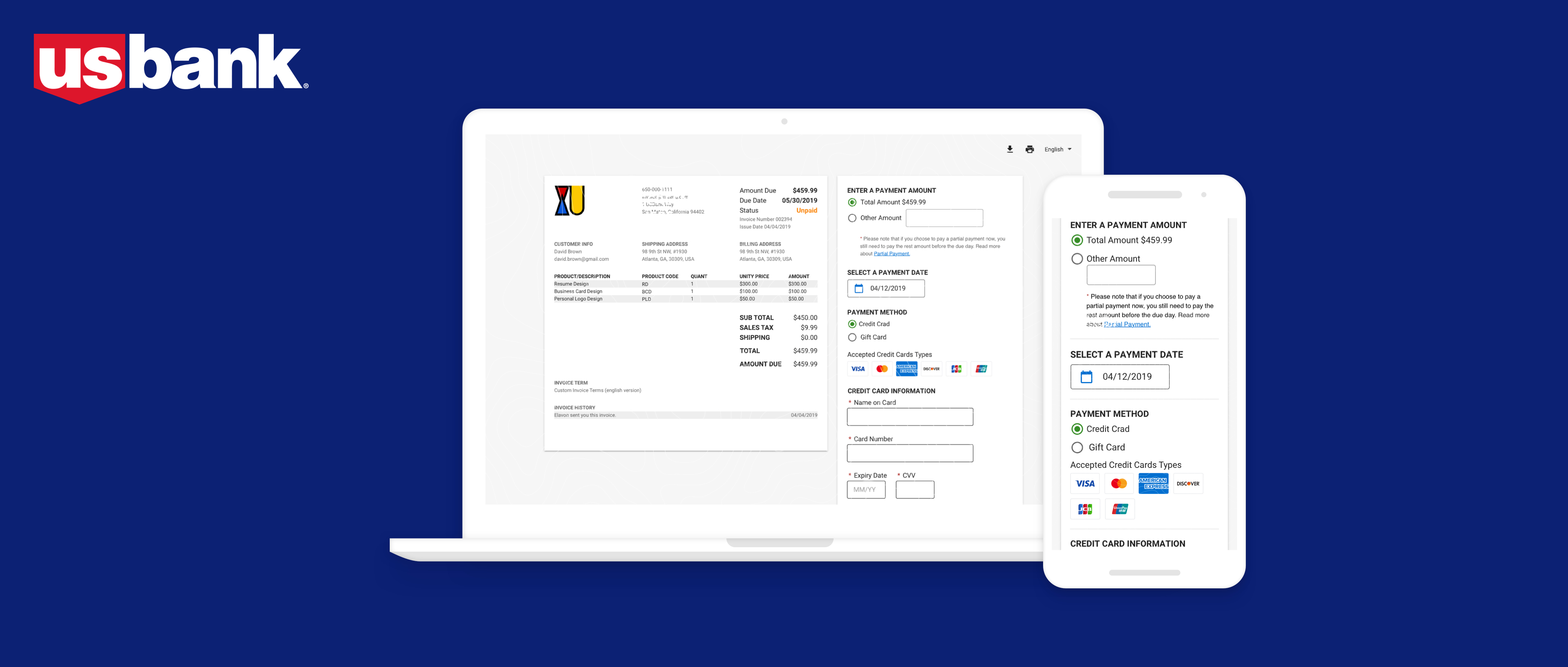
Converge is USBank's flagship payment platform. There are two groups of users: the merchants and the cardholders. The product owners wanted to introduce the partial payment feature, which is allowing cardholders to pay their quote at different methods and at different times.
The challenges
The partial payment concept doesn't exist on every payment platform, so new users could have difficulties to understand the concept.
The partial payment makes the user flow complicated, so the design should communicate the logic clearly.
Among the existing users of Converge, a lot of them are senior citizens. They have different understandings and habits about digital products compare to young people.
Timeline
Apr - May, 2019 (5 weeks)
Team
Xu Zeng (UX Designer)
Mary Ulrick
Pauline Clark (Product Owner)
Ron Yoshimochi (SDE)
Understand
What’s the value added for the cardholders?
When purchasing expensive products/services, paying the full amount all at once can be hard. Partial payment can help cardholders enjoy the products/services they want with a more flexible way to pay.
What’s the value added for the merchants?
With more flexible payment methods and payment times, the cardholders can purchase more products/services, which will help merchants grow their revenue.
Design
Design the partial payment information architecture
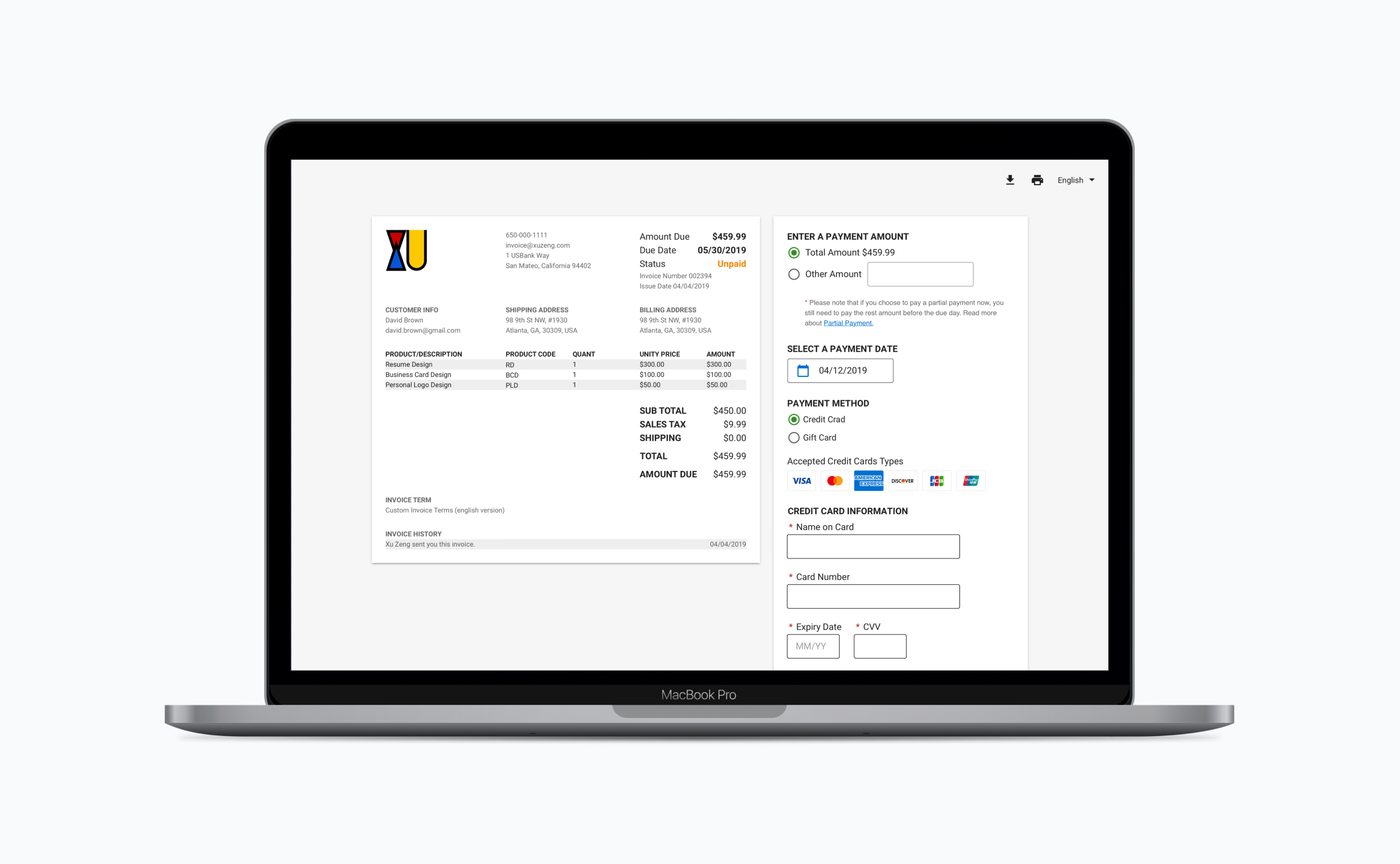
As you can see in the previous design, the partial payment information architecture is: credit card information -- billing address -- a partial amount.
I doubted this wasn't the users' mental model of a payment process. So I used the card sort method to validate my thinking. The research result proved my guess. So the partial payment information architecture according to users' mental model is: a partial amount -- payment date -- credit card information -- billing address.

Design iterations
Usability test
I run a remote usability test on usertesting.com. I tested 5 people on with a focus of people of 35 years old and above. Insights:
Bad part
(1) A few senior citizens didn't have the habit of scrolling the page. Important information on the second page was dismissed.
(2) Senior citizens had difficulty reading icons; the text was an easier way for them without any ambiguity.
Good part
(1) Consumers could easily understand the partial payment feature because they could relate it with "down payment+montly pay".
(2) As consumers, they appreciated the partial payment feature.
(3) Senior citizens had a high tolerance for long text compare to young people. They carefully read every text on the page.
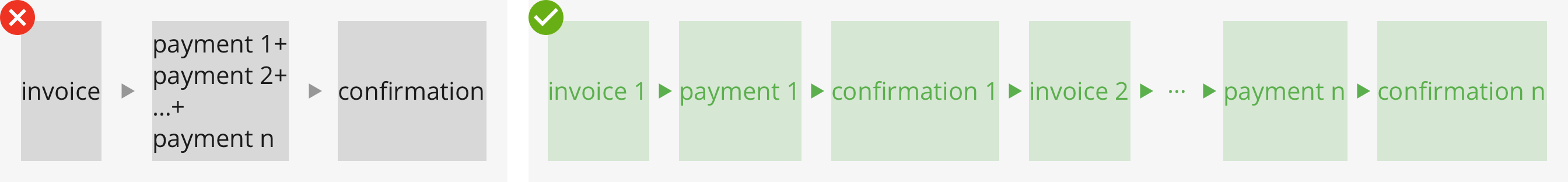
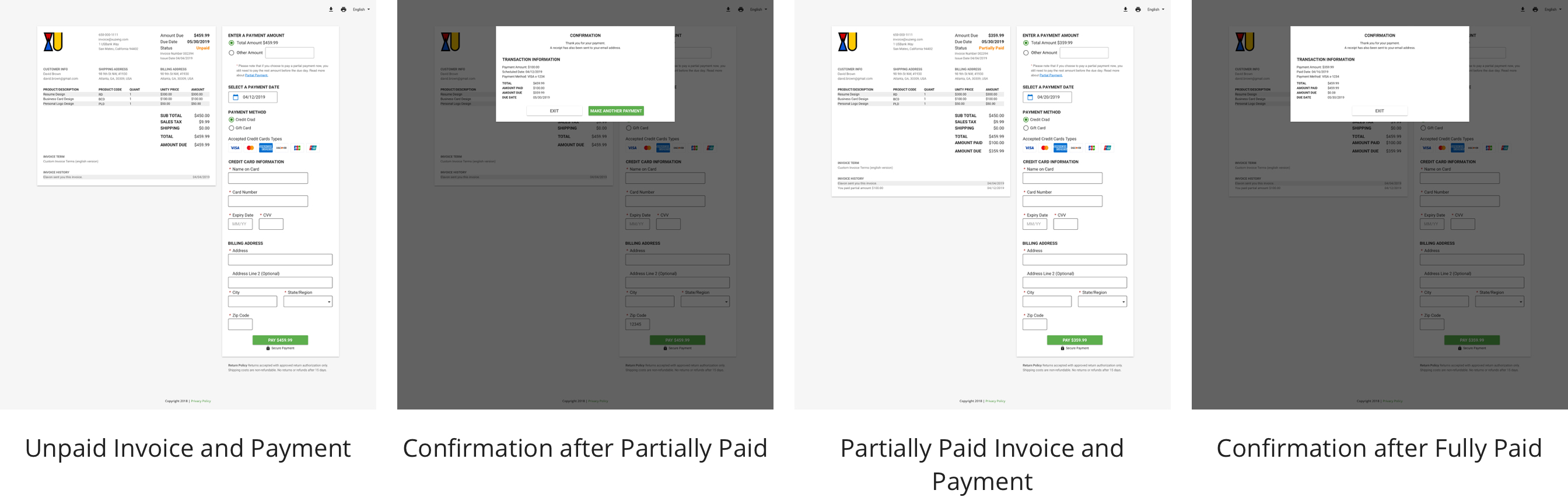
Final design decision
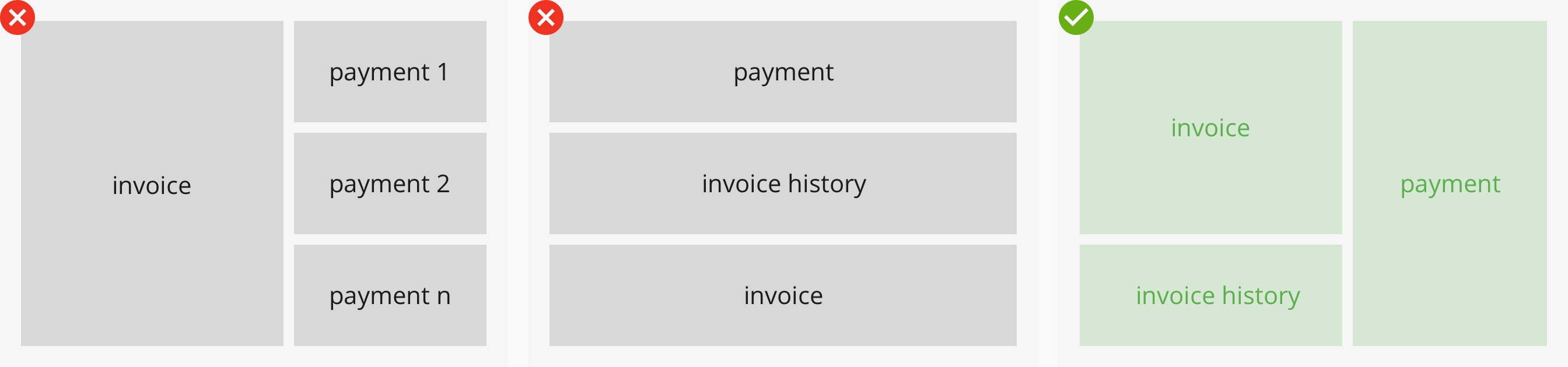
The user flow of paying one invoice with two payments
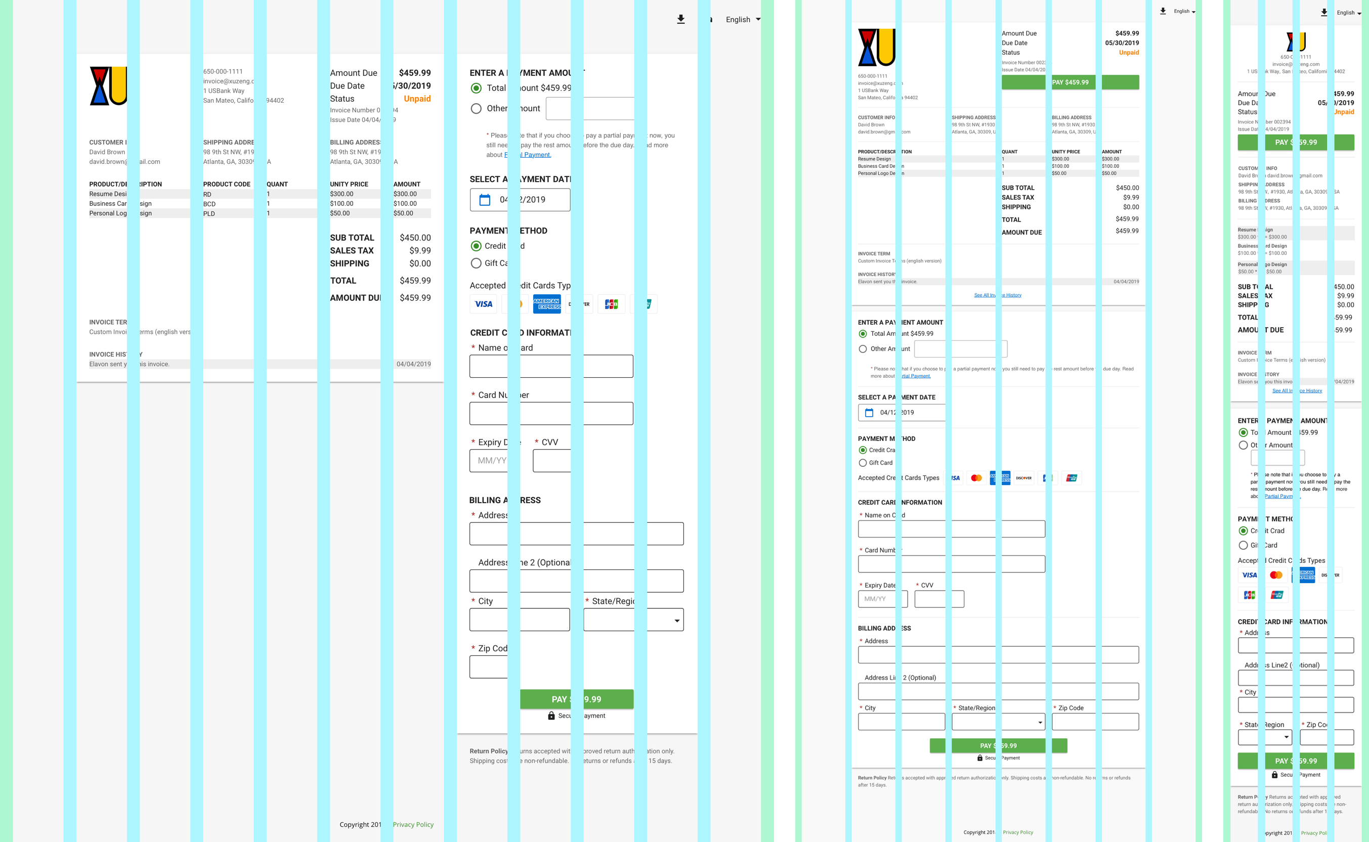
Responsive design
Reflections
What did I learn?
Design
- Designing an enterprise product and a financial product needs strong logic thinking to simplify the user flows and clear visual hierarchy.
- During the process, I practiced design forms, error handling, and responsive design.
Communication
- A financial product is not easy to understand for people without domain knowledge. Using storytelling skills to write scenarios can help.
- Always prepare solid reasons to articulate my design with the team.
My other projects at USBank
Optional products
Designing the end-to-end experience (1) for merchants to add optional products (2) for customers to choose optional products.
Customer feedback
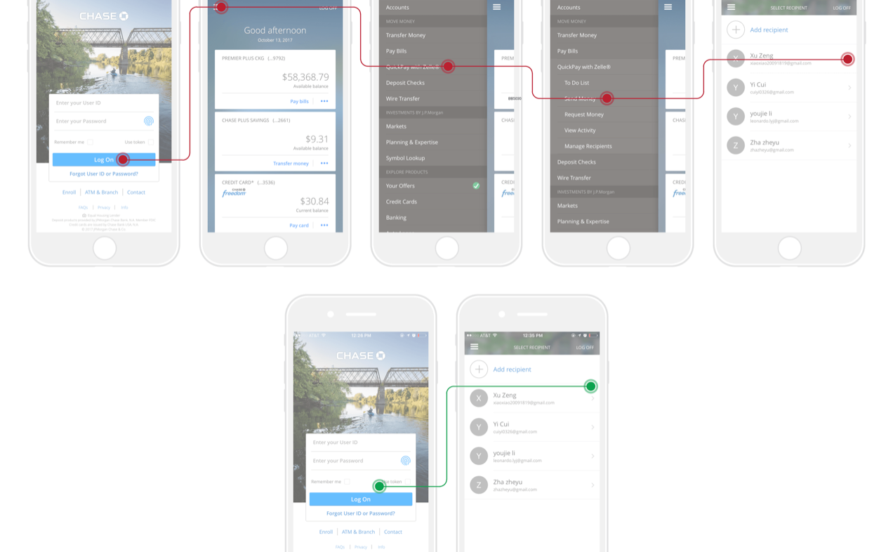
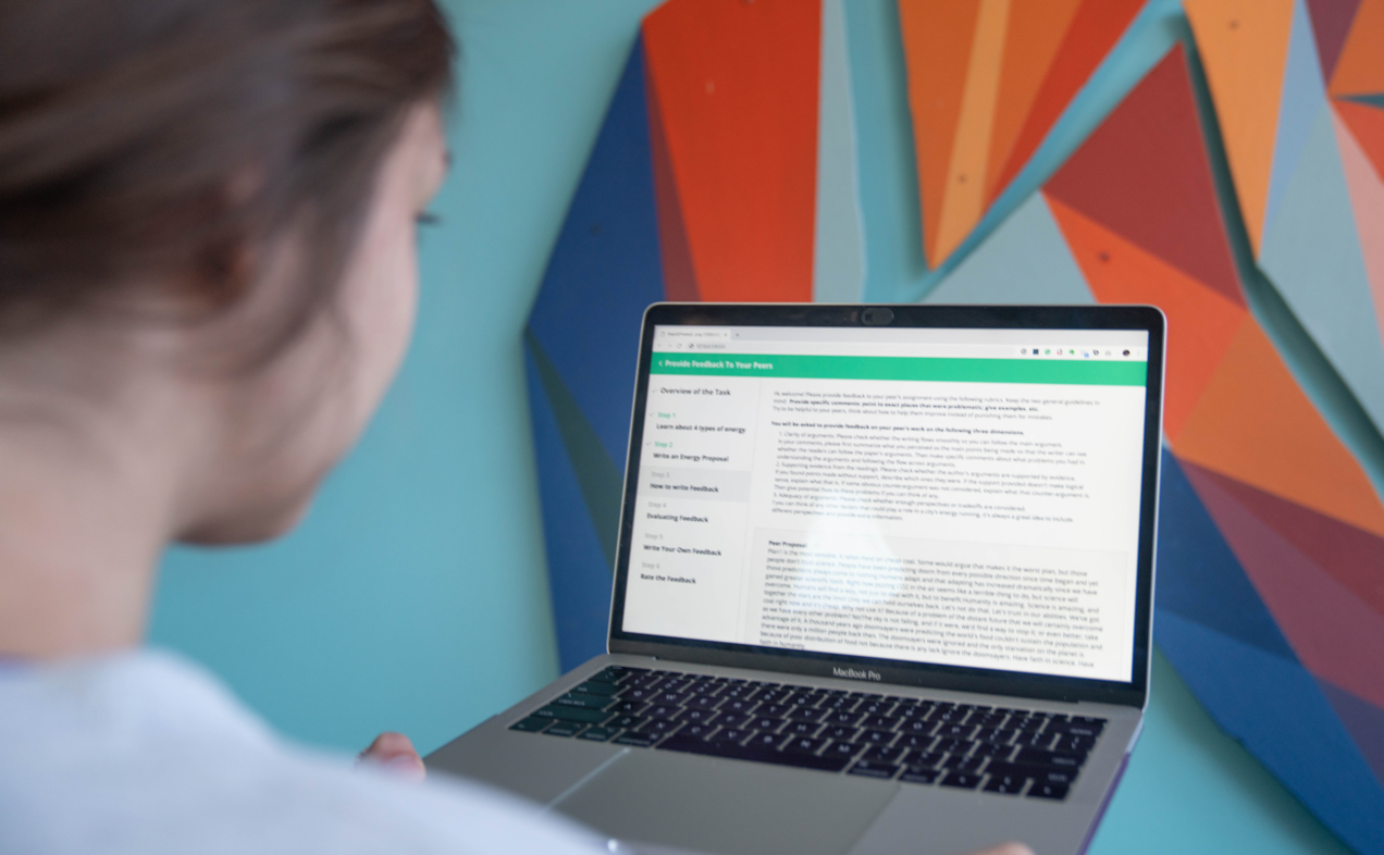
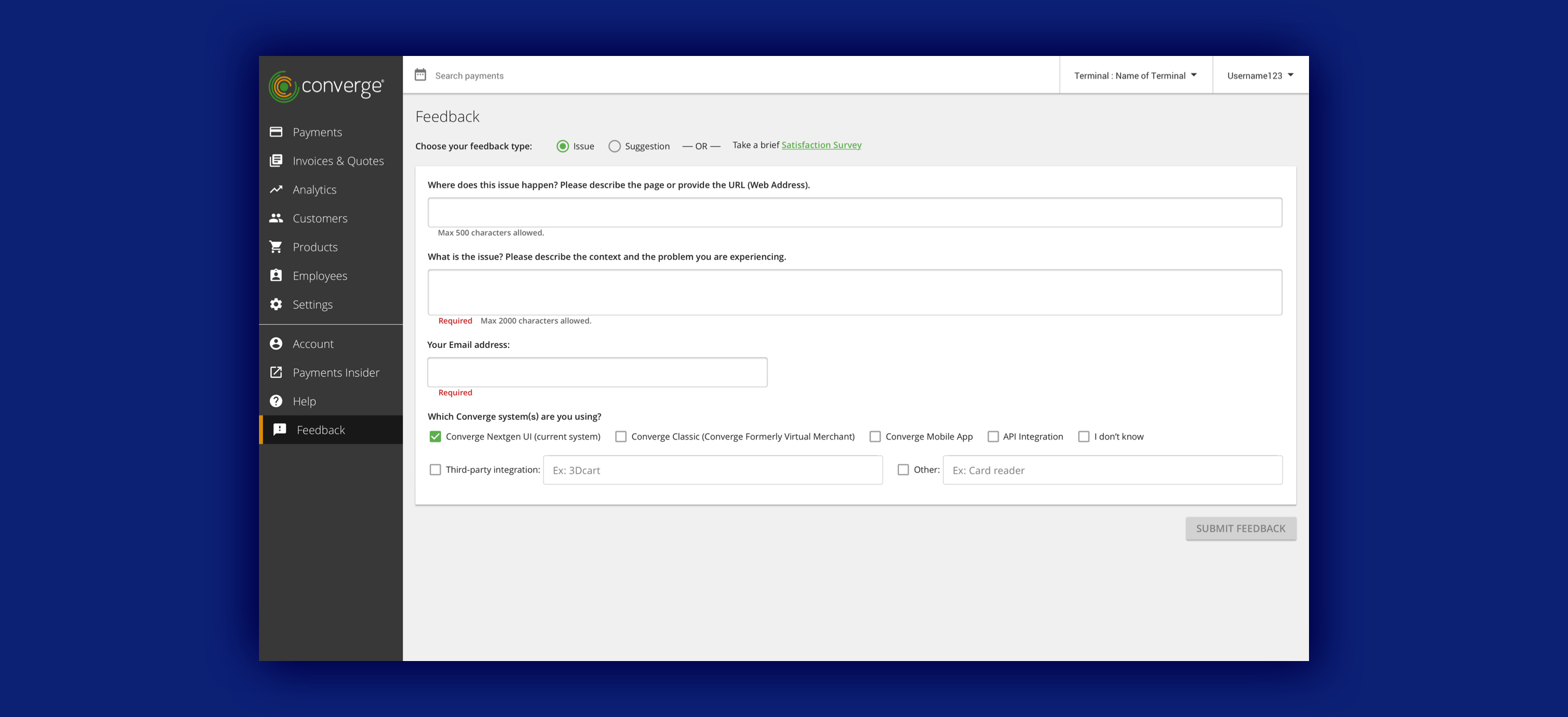
There were a lot of usability issues with the previous customer feedback page. I redesigned this page to make the business users send feedback easier, and USBank to collect feedback more efficiently.
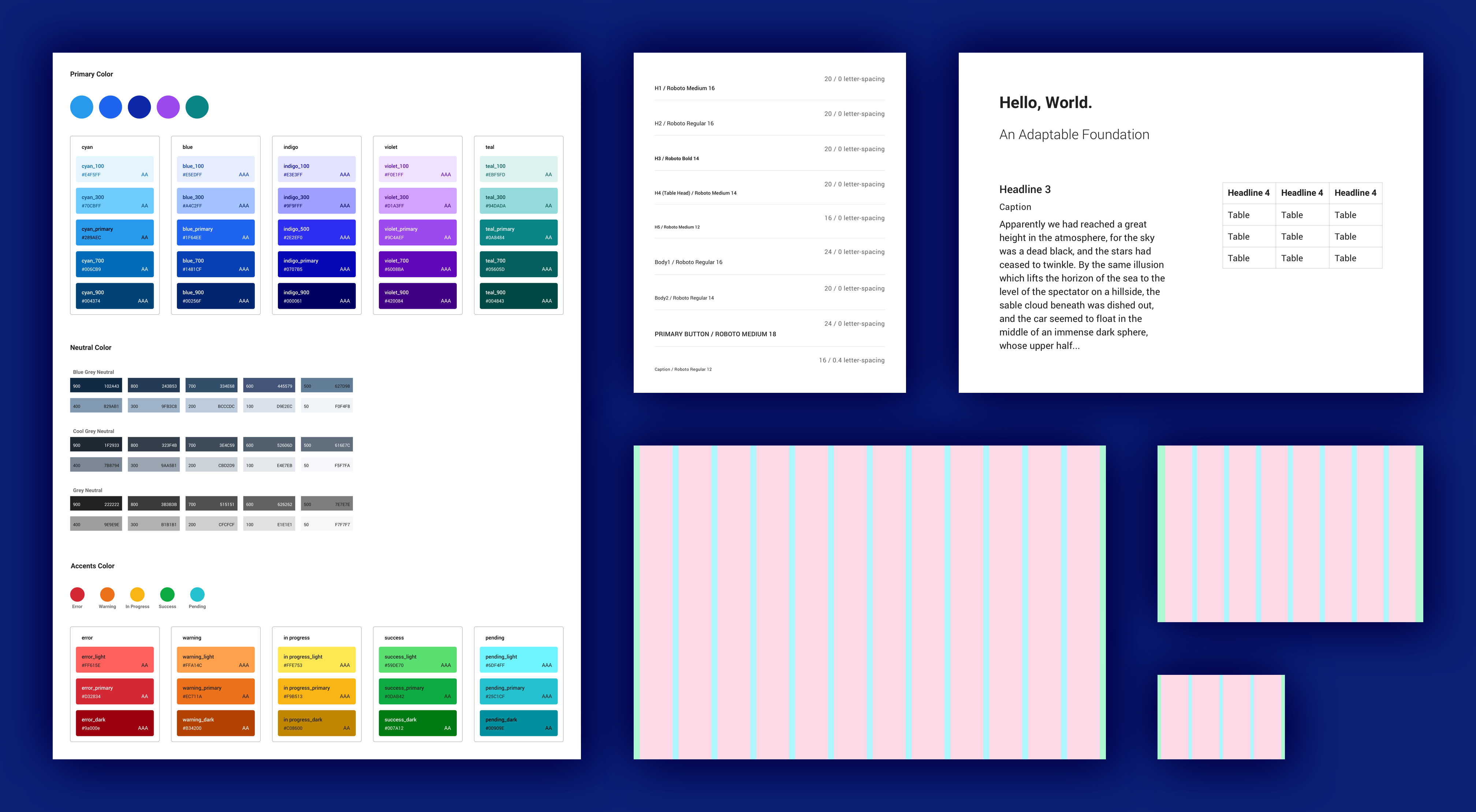
Design system
The design team was designing 5 different financial products; each of them had a distinct visual language. So having a consistent style was very important. I was in the discussion of the new design system, and I helped document the design system library file.